
Most operators assume that once they clear a few million in revenue, the hardest part of building the business is behind them. The data points the other way. Roughly 70% of growing companies stall or fail as they move through the middle-market “death zone,” the revenue band between $5M and $50M that Doug Tatum mapped in his book No Man’s Land, where the systems that carried you this far quietly stop working and enterprise-grade stability is still months or years away.
For multi-unit operators, franchisees, and regional chains, this is the most dangerous stretch they will ever navigate. The ones who come through it almost always share the same habit. They stop guessing about their locations and start running real death zone analysis against live market data, well before they sign the next lease or award the next territory.
What Is the Middle-Market Death Zone?
The death zone is the growth phase where a company’s complexity has outrun its systems while the revenue needed to fund enterprise-grade infrastructure hasn’t caught up yet.
That phase maps almost exactly onto the $5M to $50M revenue range for product and service businesses, and the most useful way to think about it is as a “step-function” problem. Growth doesn’t happen in a straight line. The costs that come with each new tier of operations (management layers, logistics, multi-site coordination) arrive in lumps, which is exactly why a company can look healthy on a revenue chart and still be quietly running out of room.
For location-based businesses specifically, the death zone shows up as a location problem first. Individual sites that made sense at one unit of scale start bleeding at three units. The trade area math that worked for a single flagship gets distorted by cannibalization from your own second or third location. Competitor density changes. Customer sentiment drifts. And by the time you notice it in your P&L, you’ve already signed two more leases.

The Five Signals That Confirm You’re in Death Zone Territory
Every location decision carries real stakes. In the middle market, those stakes compound across every site in your portfolio simultaneously. Here are the five diagnostic signals that define the death zone for multi-location operators.
1. Occupancy Cost Ratio Above 15%
Occupancy cost ratio (rent and related costs as a share of revenue) is a standard tenant-health metric in commercial real estate, and the healthy band varies by sector, from low single digits for grocery to the low teens for apparel and specialty retail, per CRE benchmarks. As a working rule for most categories, below 10% is comfortable, the 10–15% band is a yellow flag worth watching, and above 15% the location is fighting uphill against its own fixed costs regardless of how well the operation runs.
The problem in the death zone is that operators often expand into new locations using the same underwriting logic that worked at unit one. Rent-to-revenue thresholds that held at a single high-performing flagship don’t automatically transfer to a weaker secondary market. Run the numbers per site, not as a portfolio average.
2. Competitor Density Increasing Faster Than Your Market Share
Real trade areas follow traffic patterns, barriers, and distance friction, and the only way to know whether your market is getting crowded is to map actual competitor locations against your real customer draw zone.
If competitor density in your trade area has risen meaningfully since you opened, your original market sizing assumptions are already out of date. That gap is a structural disadvantage, and the first step to managing it is measuring how far it has moved.
3. Customer Sentiment Declining While Revenue Holds Flat
Review sentiment moves real money. A Harvard Business School study of Yelp data found that a one-star swing in rating shifts revenue by 5 to 9% for independent businesses. So a declining review score today is a leading indicator of revenue softness that won’t fully show up in your P&L until it’s expensive to fix. The death zone is precisely where operators stop watching this signal because they’re too focused on the top-line growth that’s still happening.
4. Trade Area Cannibalization Between Your Own Units
This one is almost never modeled before a second or third location decision. When two of your own sites share meaningful trade area overlap, you’re not doubling revenue. You’re splitting the same customer pool across higher fixed costs. Most retailers treat 15–30% trade-area overlap as the warning band, with apparel and specialty concepts targeting the lower end and high-frequency formats like QSR tolerating more. At three or more locations, this math compounds fast.
5. Local Market Trajectory Heading Negative
A neighborhood that was growing when you signed your lease might be contracting by the time your rent escalations kick in. Live local data shows which nearby businesses are closing, which ones are new, and whether the surrounding category is heating up or cooling off. Static reports can’t do this.
Why Normal Market Research Fails Middle-Market Death Zone Analysis
A typical market research report takes weeks to produce, costs thousands of dollars per geography, and reflects conditions from the prior quarter at best. For a middle-market operator managing 5–20 locations, commissioning that kind of research for every site decision is neither fast enough nor affordable enough to matter.
The result is that most middle-market operators fall back on gut instinct dressed up as experience. That works well enough at one location. It fails at five. And at ten, the gap between what you think your markets look like and what they actually look like becomes the most expensive mistake you can make.
According to PYMNTS research from 2025, 52% of middle-market CFOs reported their companies fell short of performance targets, with data-access gaps and delayed intelligence cited as primary contributors. That points to a workflow problem, not bad luck.
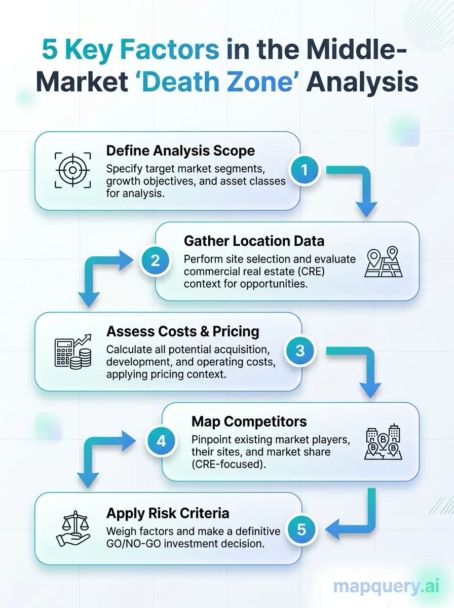
How to run a Middle-Market Death Zone Analysis
Here’s the workflow we recommend. Each step has a clear output and a decision rule attached to it.
- Map competitor density per location. Use Mapquery’s competitor mapping workflow to pin every direct competitor within each site’s actual trade area.
- Pull live customer sentiment for each site. Run the Customer Pulse feature on your own locations first, then on your top three competitors per market. Look for divergence between your sentiment trajectory and theirs.
- Calculate occupancy cost ratio for every active lease. Divide annual rent by current annual revenue per location. Flag anything at or above 15% for immediate review. Once a location clears 20%, the issue is structural and better operations alone won’t fix it.
- Identify trade area overlap between your own units. Use Saved Map Markers to visualize all your locations simultaneously. If two pins are closer together than your typical customer draw distance, you have a cannibalization risk to model.
- Assess local market trajectory using AI Research. For each flagged location, run an AI research query asking whether the surrounding market is growing, flat, or contracting. The AI research panel generates this context from live web data and provides source attribution, so you’re not working from a black-box output.
- Prioritize by risk band. Locations scoring negative on three or more of the five signals above are in the death zone. Two signals is a watch list. One signal is a monitor-and-hold.
Treat this as a recurring review rather than a one-time audit. For any multi-location business above $5M in revenue, running the analysis at least quarterly keeps your read on each market current as conditions shift.
The Five Death Zone Signals at a Glance
| Signal | What it means | Threshold to watch |
|---|---|---|
| Occupancy cost ratio creep | Rent is consuming an unsustainable share of revenue | Flag at 15%, danger above it |
| Competitor density spike | The market is crowding faster than you’re growing share | Track per-location, not category-wide |
| Customer sentiment decline | Review scores dropping while volume holds flat | Early warning, not lagging indicator |
| Trade area overlap | Your own units are cannibalizing each other | 15–30% overlap is the warning band |
| Market trajectory | The neighborhood is contracting, not growing | Requires live data, not last year’s report |
Every middle-market death zone analysis comes back to one question. Do my location decisions reflect what the market looks like today, or what I assumed it looked like the last time I checked?
Three Operators Who Needed This Yesterday
The death zone shows up differently depending on where you sit, but the blind spot is the same: location decisions made on stale or assumed data instead of what the market looks like right now. A regional chain, a franchise developer, and a commercial real estate broker each ran into it from a different angle. Here is what live analysis surfaced that the spreadsheet missed.
The Regional Cafe Group at Eight Locations
A cafe operator grew from two to eight locations over three years. Revenue kept climbing, but per-unit EBITDA slipped every year. Two of the newer cafes had landed in trade areas that overlapped with existing units, and a third opened into a neighborhood where a competitor cluster had formed in the 18 months between signing the lease and opening the doors.
Running a middle-market death zone analysis against live competitor density data revealed the overlap issue in the first pass. The operator closed one location and renegotiated the lease on another before the decline compounded further.
The Franchise Developer at Fifteen Territories
A franchise development manager was awarding territories on ZIP code population data and historical category performance alone, with no live competitor mapping, no customer sentiment context per territory, and no market summary to work from.
Two of the last five territories awarded underperformed their projections by 30%+ in the first year. A post-mortem using the
franchise site selection workflow
identified both territories as high-density competitive zones where a new entrant would face a structural disadvantage from day one. The data existed. It just wasn’t in the underwriting process.
The Commercial Real Estate Broker Pitching a Middle-Market Tenant
A broker was pitching a 4,000 sq ft retail space to a regional operator. The landlord’s offering memorandum included neighborhood demographics from two years prior and a hand-drawn trade area map. Before the pitch, the broker pulled live market data using Mapquery’s
commercial real estate workflow
, which showed three new competitors had entered the immediate trade area in the prior 12 months and customer sentiment for the category in that neighborhood had declined 0.4 stars on average.
Did You Know?
52% of middle-market CFOs reported that their companies fell short of their performance targets in 2025, with data gaps and delayed intelligence among the primary causes.
PYMNTS
Final Thoughts
In the middle market, the death zone is a location problem long before it becomes a finance problem. The operators who get through it aren’t necessarily running better businesses. They just keep a clearer, more current picture of their markets and act on it early, before they sign the next lease, award the next territory, or wait for the P&L to confirm what the reviews already showed months earlier.
Everything this framework asks for already exists in live data. Five signals to watch, a repeatable way to score them, and a clear threshold for when to act. The only real question is whether you’re reading that data as it shifts or waiting on a report that was stale the day it landed.
So start small. Pick your two highest-risk locations, run the five-signal check, and let the live picture shape your next move. Mapquery is free to start, and your first pass takes minutes, not weeks.
Frequently Asked Questions
What is the middle-market death zone in business?
The middle-market death zone, also called “No Man’s Land,” is the revenue band roughly between $5M and $50M where a business has outgrown its startup systems but hasn’t yet achieved enterprise-level infrastructure. It’s the phase where original processes break down, management overhead spikes, and cash can evaporate faster than growth can cover it.
How do I know if my business is entering the middle-market death zone?
Key signals include rising occupancy cost ratios across multiple locations, stagnant customer sentiment scores, competitor density increasing faster than your market share, and declining unit-level economics despite top-line revenue growth. A middle-market death zone analysis maps these signals against your actual trade areas, not just ZIP code assumptions.
Can location data help a business survive the middle-market death zone?
Yes. Geospatial intelligence helps you identify which locations are dragging performance, where competitors are clustering, and which markets are genuinely underserved. Companies using location-based targeting see conversion rates increase by up to 200% compared to non-targeted approaches, making location data one of the highest-leverage tools available during a difficult growth transition.
What does a middle-market death zone analysis actually include?
A thorough middle-market death zone analysis covers five areas. It tracks occupancy cost ratio per location, competitor density in each trade area, customer sentiment trends by site, overlap between your own units, and whether the surrounding market is growing or contracting. Each of these signals needs live data, not a report that was accurate six months ago.
Is Mapquery.ai useful for middle-market companies, not just startups?
Mapquery.ai is built for exactly this stage. Middle-market operators managing multiple sites can run competitor mapping, customer sentiment analysis, and AI-generated market context across up to 500 locations per project on the Pro plan. The free tier, with 10 daily research credits and up to 3 saved projects, is enough to run a first-pass death zone analysis on your highest-risk markets.
How is middle-market death zone analysis different from standard market
research?
Standard market research gives you a snapshot. Middle-market death zone analysis is ongoing, diagnostic, and location-specific. It asks why a particular site is underperforming, not just whether the category is growing nationally. That requires live local data, not a PDF from a research firm published eight months ago.

Run Your First Death Zone Analysis Free
Mapquery pulls live competitor, sentiment, and trade area data for any location you research. 10 daily research credits, no credit card required.